
Stress takes a lot out of you. We all get overwhelmed sometimes by simple things like being overly busy at work and not having enough time to go through our to-do list, etc. There are many ways to help you relax, but setting calming colours in your house will be one of the most effective ways.
Our mind and body naturally respond to colour. Stronger, more vibrant colours can energise and stimulate our brains, occasionally increasing anxiety. The contrary is also true – softer, more neutral colours can make you feel peaceful and quiet, help in breathing, and relax. While keeping this mental response in mind, please read below our tips and recommendations for choosing soothing colours for your home.
Tips for Choosing Relaxing Colours for your Home
Settling on a calming colour can be a challenging task. So, when deciding on the colours you want to use for your home, consider how you will use the space and how that will affect you and leave the rest to your emotions.
- Stick to muted, neutral colours
- Avoid bright, bold colours
- Consider natural colours
- Use lighter shades of your chosen colour
- Choose colours with cool undertones
- Use colour psychology to choose relaxing colours
- Consider lighting when choosing colours
- Test paint samples on your walls
Calm Colours to Reduce Stress
Many colour variations can help against stress. Calming paint colours, like green and blue have soothing characteristics, encouraging well-being. They also provide a sense of space and calm. Soft neutrals also enhance relaxation, so variations of white, cream, beige, and light grey are always good options. When painting a room in your house, think about how you want it to feel. If your goal is relaxation, you should choose certain colours.
Sky Blue
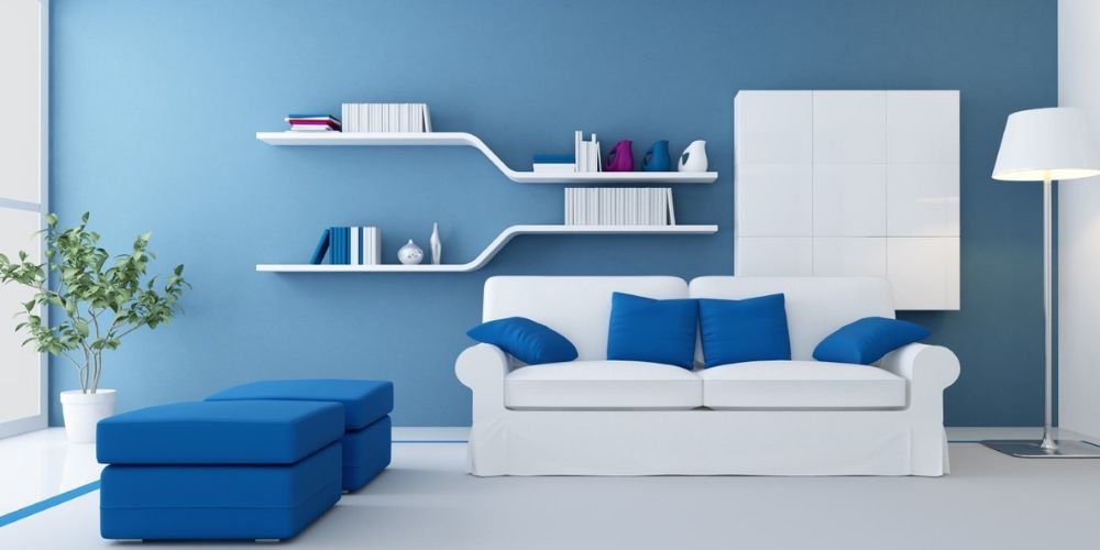
The sky blue colour reflects peace and reflection. Many people associate it with visions of a clear sky or freshwater. It is an excellent choice for creating spaces for unwinding and de-stressing.
Lavender
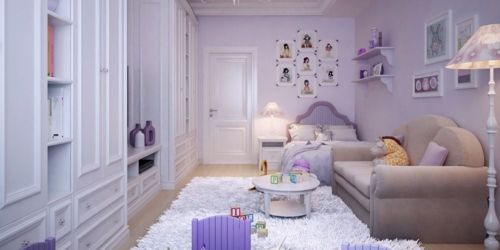
Lavender is another soothing colour that has relaxing and therapeutic qualities. For some, lavender is a delicate colour, but the light pastel tones are soft and pretty. Often, the lavender is combined with touches of grey, adding joy and warmth. And even if you feel afraid to paint a whole room or wall with lavender, use it as a backdrop for some other contrasting colours, and you will love the finished look.
Pink
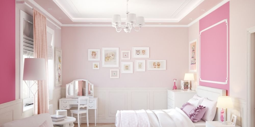
Pink is one of the most popular calming colours that are increasingly in demand due to its range of tones and versatility. Any light, soft pink would open the space, transforming it into a new alternative to white and beige. When it comes to relaxing bedroom space and living areas, pink is a perfect colour choice, as it is clean and uplifting.
Soft Green

Any hue of green makes us think of nature, which calms, stills, and harmonies our hearts. We know spending time in nature is quality-spent time due to mood improvement, a reduction in anxiety and stress, and an increased feeling of happiness. So why not use that green relaxing colour scheme to bring contentment and warmth into your home?
Tan
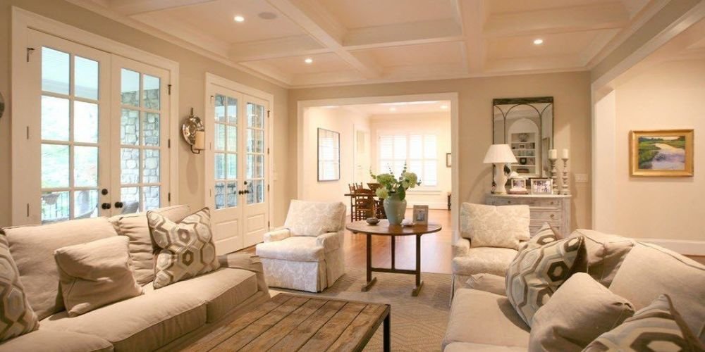
Tan is a colour that might not be the first choice for many people. Being a great neutral, it is a perfect base for highlighting many other colours. And while tan might remind some of the ’90s living areas, today’s tan is chic and modern. Offering a nice warmness, like candlelight, when on par with white or other neutral tones, you get a superb warm neutral, bringing a relaxing mood back to the surface.
Classic White
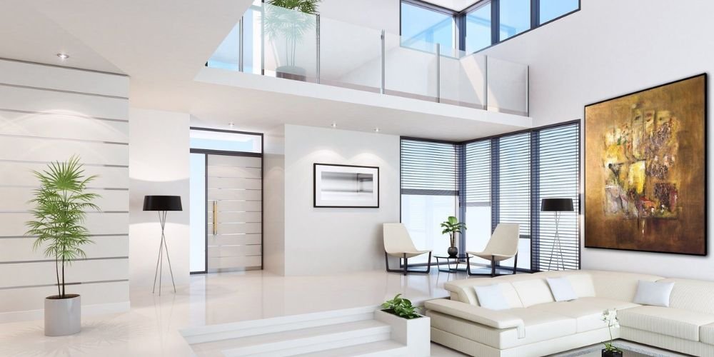
White is a popular calming colour that is neutral, but its subtle shade variations can be interesting because they often elicit different reactions from people. You don’t want to go too dull, as it can create a sense of drabness. On the other end of the spectrum, if the shade is too bright, reminiscent of labs or hospitals, it can increase your stress level. It’s better to stick to calm, warmer, creamier versions of white for a soothing effect.
Soft Gray
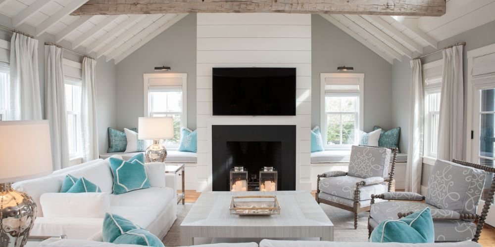
A classy and warm description of soft grey would be appropriate. With its gentle and tonal sheen, it creates a sense of invitation, making you feel serene. Many people say that this soothing colour makes them feel comfortable, refreshed, and relaxed when staying in a room with delicate shades of grey.
Pale Yellow
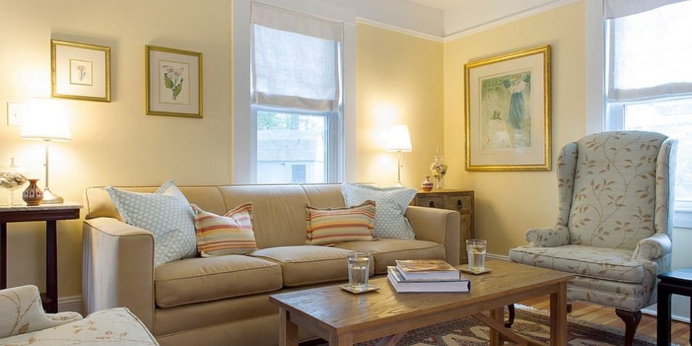
The colour yellow is more versatile than people often believe. The right shade can be sophisticated and daring or calming and soft. Of course, you’ll want to avoid something overly bright and opt for a creamy yellow that can instantly warm up a room. Kids’ and guest rooms, or even bathrooms, can be great spaces to try this colour.
Conclusion
When selecting calming paint colours, you can’t go wrong. The beauty of these colours is that you can combine them in a way that imitates nature. Greens and blues will bring to mind blue waters, open skies, and lush landscapes. Neutrals will create an earthy feel, while softer and stronger colours can bring warmth and peace. Approach the process with an open mind and allow yourself to feel. After all, if you don’t like the results, you can always repaint the room.
Are you ready to paint your home or bedroom a more soothing colour? Transform your space with Bourne Decorators. Contact us today to schedule a consultation and discover how our painting and decorating services can bring new life to your home